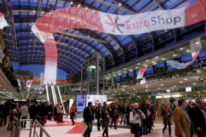
Mannequin Collection Launching at EuroShop 2026
As you may have seen, our sister brands Kesslers London and Genesis Mannequins will be exhibiting at the iconic EuroShop 2026. While Proportion London won’t
Home » Colour Psychology in Visual Merchandising for Makeup Brands
We speak a lot about visual merchandising and the different ways of using it to attract customers in our articles. In this article, we are going to focus on one of the most important, and perhaps slightly overlooked, aspects of visual merchandising – colour – and how makeup and cosmetics brands use it to entice consumers and generate sales.
Visual merchandising is the creative display of products to attract customers. It can be used both online and in-store, and involves the use of various visual elements, such as colour schemes, to create a captivating customer experience.
Colour psychology is the study of how our moods and behaviours can be impacted by colour. It explores how different colours can influence emotional responses, and how these responses are affected by environmental factors, such as age and cultural background.
Colour psychology is an important element of visual merchandising. If different colours evoke different emotions, finding the colour that most encourages your target audience to purchase a product is critical. In fact, research shows that 52% of shoppers would choose not to return to a store based on aesthetics alone. Another study suggests that incorporating colour into advertisements engages customers 42% more than advertisements in black and white.
Researchers have also found that up to 90% of snap judgments made about products can be based solely on colour. It seems that colour stands out as the quickest, simplest, and most impactful visual merchandising technique to elicit an emotional response, making it a very important factor to consider when designing your display or store layout.
As of 2022, the cosmetics and skincare industry is worth a whopping £8.94 billion, with the cosmetics sector increasing 9.3% year on year. In order to have a slice of this incredibly profitable pie, companies in the cosmetics industry need to be using every tool at their disposal. And with makeup being an incredibly visual art, colour is an easy way to make the products pop.
Choosing the right colour can create a strong brand identity and personality for a beauty brand. Over 80% of consumers believe that the colour of the packaging is an important factor in buying a product. Pink, for example, is often associated with more feminine products, and with 83% of women in the UK wearing makeup, it is no wonder that a lot of makeup packaging (think Charlotte Tilbury and Kylie Cosmetics) is pink.
Another popular packaging colour within the makeup industry is silver, especially within luxury cosmetics brands. This is because silver is associated with sophistication and glamour, making it ideal for high-end makeup packaging. The Chief Operating Officer of metal packaging manufacturing company, Cameo Metal Products, agrees, stating “Consumers like the ‘eye appeal’… metallics stand out on the shelf… Metallic looks are associated with luxury goods—and convey ‘high value’ to consumers.”
It is important to consider the aesthetic presentation of your packaging when designing your cosmetics displays. In fact, the attractive presentation of cosmetics can increase sales by between 20 and 30%! With this in mind, placing primary, secondary or tertiary coloured packaging together on a shelf may make for a more visually pleasing display.
Similarly, different colours can create various moods for beauty products. Warm colours such as reds and oranges can portray energy, whereas cooler colours convey a sense of calmness and relaxation.Using colour to set the right mood for your products, you can create a memorable experience that customers will associate with your brand.
Similarly to creating a positive mood that consumers link to your brand, colours can also influence consumer behaviour through purchase decisions and brand loyalty. Red, for example, is often seen in sales and promotions as it creates a sense of urgency, and so it may be a useful tool to use in your calls to action in order to drive sales.
Charlotte Tilbury Beauty is a high-end makeup and cosmetics brand, founded by makeup artist, Charlotte Tilbury, in 2013. Since its conception, the brand has become one of the most coveted in the world, promising glamour, timeless sophistication and confidence to each of their customers.
In order to create this confidence that the makeup brand promises, the packaging has to project the company’s core values – playfulness, innovation and glamour. Their packaging uses rich golds, browns and dark pinks, with a hint of rose gold in the logo, in order to exude luxury. This use of warm tones portray energy, and the use of gold tones promotes a feeling of sophistication and glamour – two pillars of the Tilbury brand.
This year, Charlotte Tilbury partnered with Disney to celebrate their 100 year anniversary! To commemorate this occasion, Charlotte Tilbury chose some of her most iconic products to be rebranded as part of a limited edition collection, themed with Disney’s classic character, Tinkerbell.
This rebrand needed to continue the luxury feel of the company, but add a hint of playfulness and fun to showcase the Disney collaboration. The design team at Charlotte Tilbury makeup managed to complete this perfectly, keeping the packaging of their Magic Cream and Beauty Light Wand almost the same, with the addition of a Tinkerbell outline in their traditional rose gold colouring. They even launched a limited edition Charlotte Tilbury X Disney makeup bag, manufactured in the iconic Charlotte Tilbury ‘night crimson shade and embroidered with a magical Tinkerbell design.’
To mark this momentous collaboration, visual merchandising and display design company, Kesslers London (Proportion London’s parent company) was invited to work with Charlotte Tilbury to create an eye-catching and interactive space in order to promote this collection at premium department store, Selfridges.

Using high quality materials in shades that matched Tilbury’s celebrated luxury colour scheme, Kesslers’ experienced technical team engaged with Selfridges and the Charlotte Tilbury design team to create a popup store, reflecting London’s famous landmarks and Disney’s iconic theme of magic to successfully deliver Tilbury’s slogan, ‘Make your beauty dreams come true!’

This pop up store included a range of luxurious looking product tables, interactive games and a short Peter Pan inspired Charlotte Tilbury Film, made by Disney’s cartoonist. The pop up store was live in London’s Selfridges store from the end of July until the beginning of September, and really showcased how colour psychology works with other interesting and interactive design elements to build a unique and beautiful visual merchandising display.

At Proportion London, we live and breathe all things visual merchandising, and so we consider ourselves a dab hand at understanding colour psychology in relation to product displays. We work with a large range of clients, both high street and luxury, to design beautiful, functional displays and store layouts that convert the consumer.
We also have a range of mannequins available for sale or hire, including mannequin heads that are perfect for displaying your best-selling cosmetics or accessories.
Contact us today to discuss your requirements and discover how we can help you.
As you may have seen, our sister brands Kesslers London and Genesis Mannequins will be exhibiting at the iconic EuroShop 2026. While Proportion London won’t

Now 2025 is quickly coming to an end, the team are having a look back at all the iconic moments over the year. Some incredible

2025 was a year filled with exceptional stores, window displays, and of course – fashion. Visual merchandising in London proves every year it is an